For this poster, I was initially inspired to have ice cream be the main idea by my Communication Arts Magazine 2011 January/February Typography Annual 1 page 175, where I found ice cream that had different label types. I liked the packaging style, which was somewhat old fashioned but yet current.
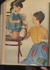
My hand drawn elements were tracing the words "since 1752" from a font found on Photoshop, as well as tracing the outline of the picture I scanned in from Good Housekeeping from 1962 Jan-June issue, page 96. The background of my poster has all the different flavors of ice cream that you can find at http://www.coldstonecreamery.com/ as well as http://www.baskinrobbins.com/. I combined what the two ice cream places had to offer, and used photoshop to type in the flavors I chose out of their menus.
The ice cream cone that the little girl is holding was copied from images searched on http://www.google.com/images, using the the search term "ice cream cone" making the images I find 2MP or larger.
The year 1752 is a made up year, but it is using numbers I like most that looked good together, and would also not be too skewed to make someone think it was not a true date that ice cream was invented. Another book I used for some ideas of styles and layouts is called Typography : the annual of the Type Directors Club. no.30, Author listed as Type Directors Club (U.S.)found on page 289.


No comments:
Post a Comment